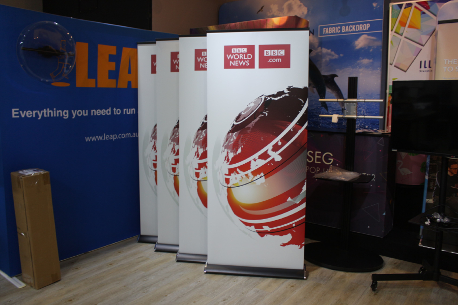
Roll-up banners are highly effective for boosting your brand visibility and presenting your products. Whether you're participating in a corporate function, trade show, or exhibition, these banners serve as the initial focal point for prospective customers upon entering the event location. However, with so many companies with banners competing for attention, you might want to consider engaging in roll-up banner printing services to provide an attention-grabbing roll-up banner that sets you apart from your competitors.
Below, we look at the five valuable tips to create a captivating roll-up banner design that leaves a lasting impression on your target audience.
Define your objectives
Before diving into the design process, clearly define the objectives of your roll-up banner. Are you looking to generate leads, promote a specific product, or increase brand awareness? By identifying your goals, you can tailor your design to communicate your message effectively. Keep your objectives concise and focused to avoid cluttering your banner with excessive information.
Simplicity is key
In the world of roll-up banners, simplicity is key. Aim for a clean and uncluttered design that allows viewers to quickly grasp your message. Use a clear and bold headline that captures your attention and conveys your main selling point. Include minimal text, focusing on key information such as your brand name, tagline, and contact details. Remember, less is more when it comes to roll-up banner design.
Choose eye-catching graphics
Visuals play a crucial role in attracting attention to your roll-up banner. Select high-quality images or illustrations that are relevant to your brand and message. Ensure the graphics are clear, vibrant, and easily readable from a distance. Incorporate your brand colours to maintain consistency and create a cohesive look. Additionally, consider using large, attention-grabbing visuals that create intrigue and curiosity.
Typography matters
The choice of typography can significantly impact the effectiveness of your roll-up banner design. Opt for clear and legible fonts that are easy to read from a distance. Avoid using multiple fonts that may create confusion or distract from the main message. Ensure the font size is appropriate, with larger sizes for headlines and smaller sizes for additional information. Experiment with font styles to add personality to your design, but ensure they align with your brand identity.
Incorporate a call to action
To maximise the impact of your roll-up banner, include a compelling call to action (CTA). A CTA prompts customers to take a specific action, such as visiting your company website, contacting a number for detailed information, or purchasing a product. Use concise and action-oriented language, such as "Visit Us Today!" or "Call Now for a Free Consultation!" Place the CTA strategically, making it easily noticeable and accessible on your banner.
Conclusion
Designing an attention-grabbing roll-up banner requires careful planning and consideration. If you’re looking for the perfect roll-up banner for your next corporate event or roadshow, get in touch with a retail window display company in Singapore that can help you design a roll-up banner that stands out from the rest.
If you need help deciding on a suitable design or banner type, fret not! Our experts at New Wave Display are equipped with the skills to design all types of advertising displays using Adobe Photoshop, InDesign, and Adobe Illustrator. Our team can guide you through the design process and provide you with best roll-up banners or wall sticker printing for window displays in Singapore. Visit our website https://newwavedisplay.com.sg/ or contact us at +65 6241 5280 to learn more about our products and services.


